The concept
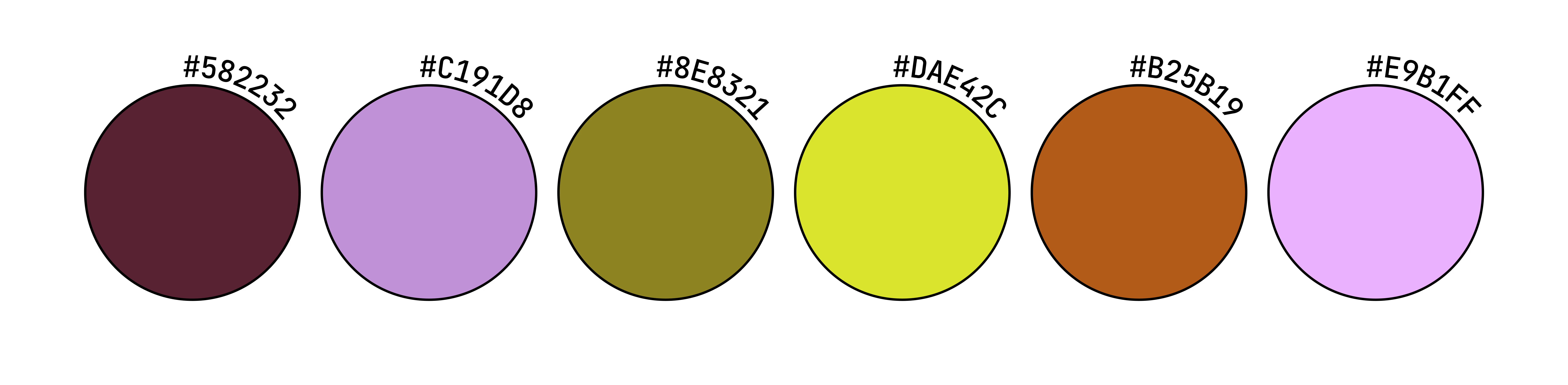
Playfulness was at the heart of Tangly from day one. The idea was to create a visual identity that felt colorful, expressive, and full of personality, without losing its sense of cohesion. Bold enough to stand out, but considered enough to hold everything together.
We developed a flexible visual language built around vibrant colors, playful typography, and simple yet distinctive graphic elements. The result is an identity that leaves plenty of room for experimentation while maintaining a recognizable look and feel, no matter how many directions the content takes.
A little storytelling, a little creative chaos, and a whole lot of curiosity. Tangly is a personal project where ideas are free to wander, stories take unexpected turns, and there's always something new to get tangled up in.
The logo
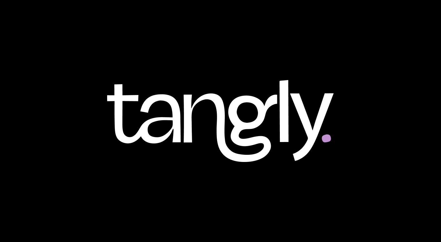
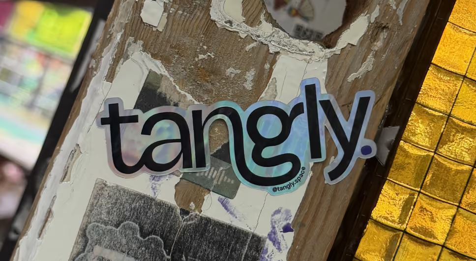
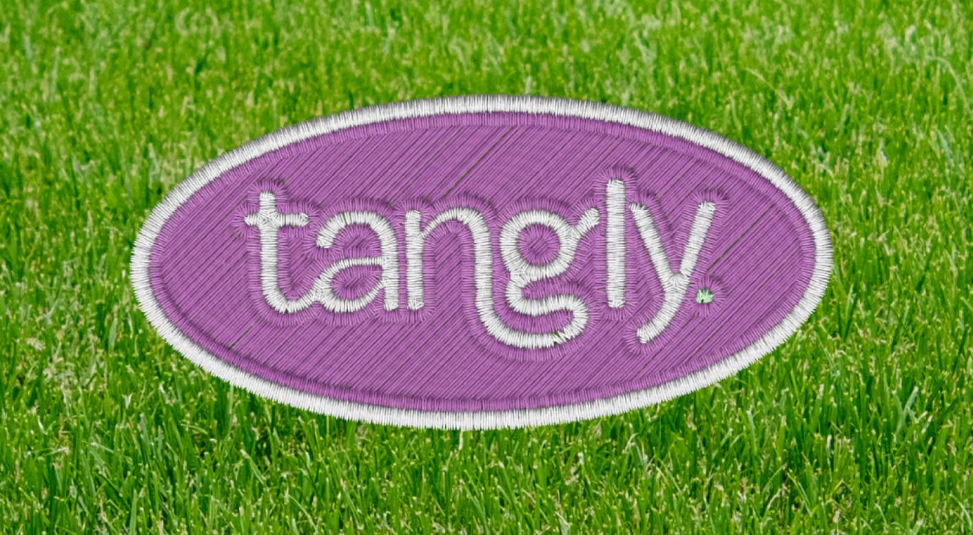
They say there's no client more demanding than yourself, and this logo is living proof. After countless sketches, concepts, and versions (and a fair amount of second-guessing), one thing was clear: it had to be just right. The only problem? I wasn't entirely sure what just right looked like.
But after plenty of trial and error, it finally clicked. The result? A logo that feels playful, full of personality, and unmistakably Tangly. And the best part? Every single time I look at it, I still absolutely love everything about it. Worth every iteration.
Brand Personality
Tangly is anything but beige, and its visual identity was designed to reflect just that. Bursting with color, personality, and a healthy dose of quirkiness, every element is an invitation to get curious and have a little fun.
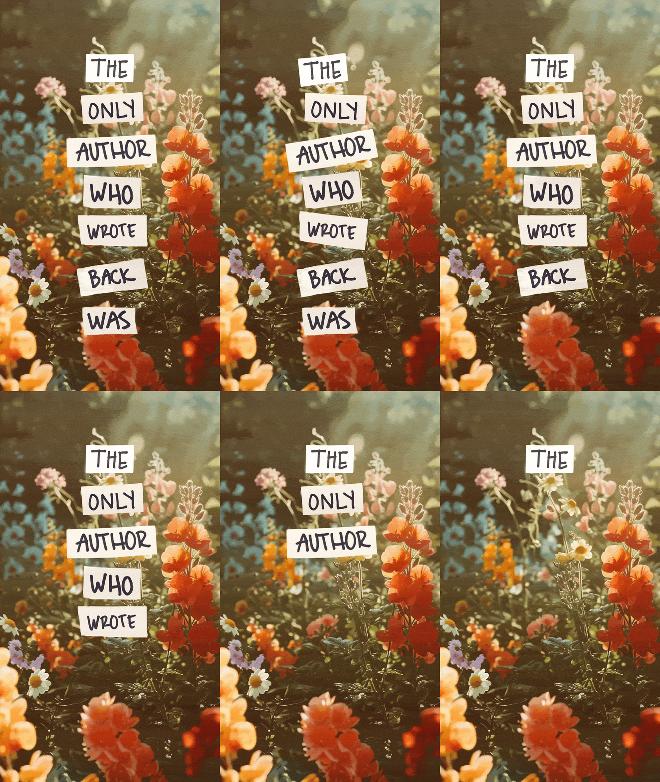
From paper-inspired textures and cutout-style graphics to funky animations and unexpected details, the brand embraces a playful, almost handmade aesthetic. It's a mix of digital and analog, where things don't have to be perfectly polished to feel thoughtfully designed.
The result is a visual world that's lively, expressive, and constantly evolving, while still feeling unmistakably Tangly.
Typography
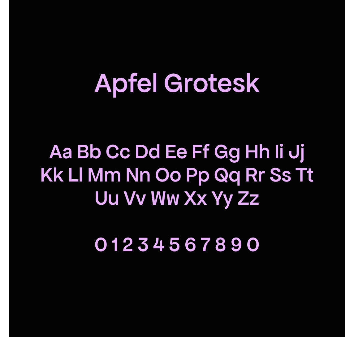
For Tangly, we chose Apfel Grotesk, a contemporary sans-serif typeface with a clean, confident character. Its simple shapes and balanced proportions bring a sense of structure and clarity, helping balance out the more playful elements of the visual identity.
Versatile and easy to read, it works across everything from bold social media graphics to more informative content, keeping the brand feeling cohesive without losing its fun, approachable personality.

Social media & digital assets
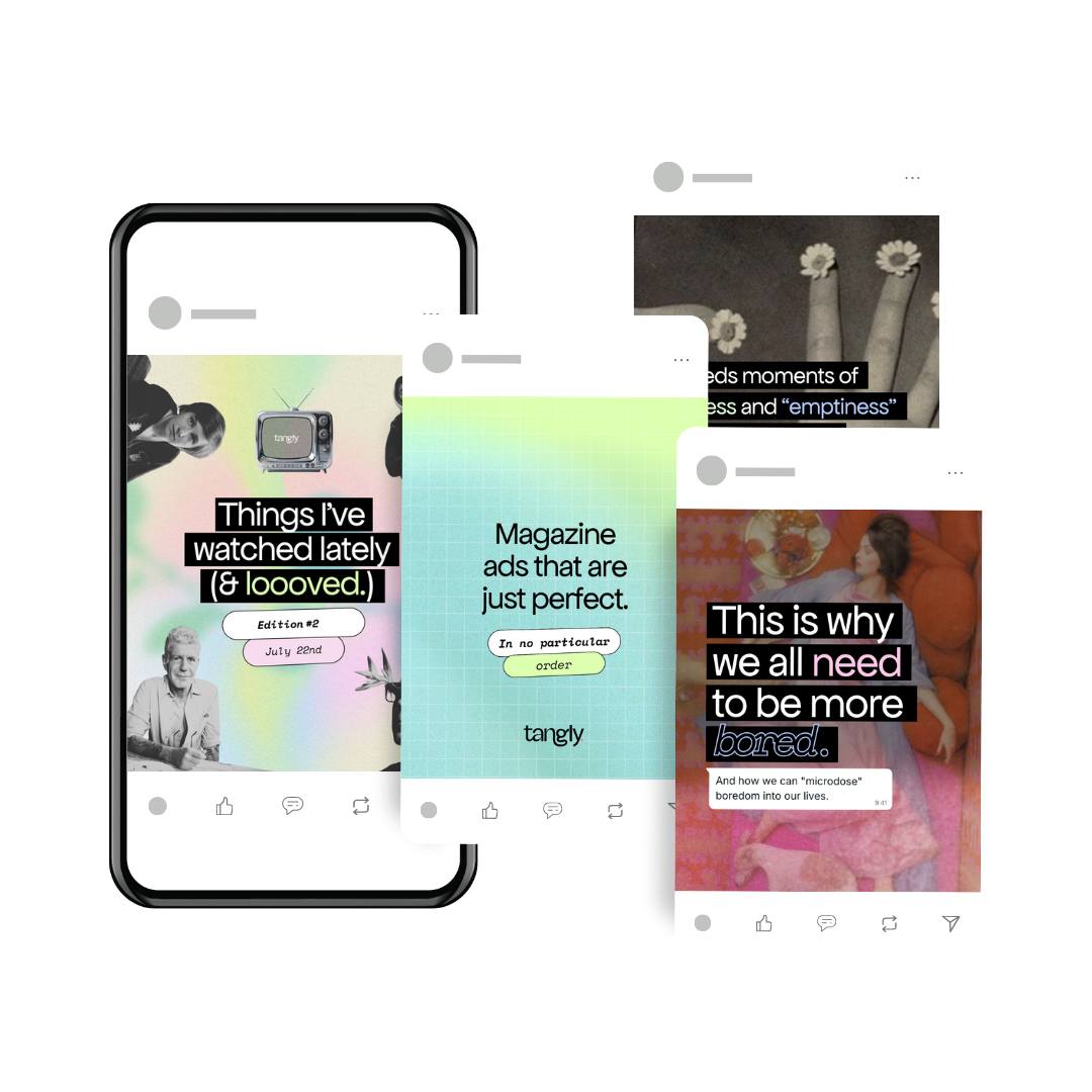
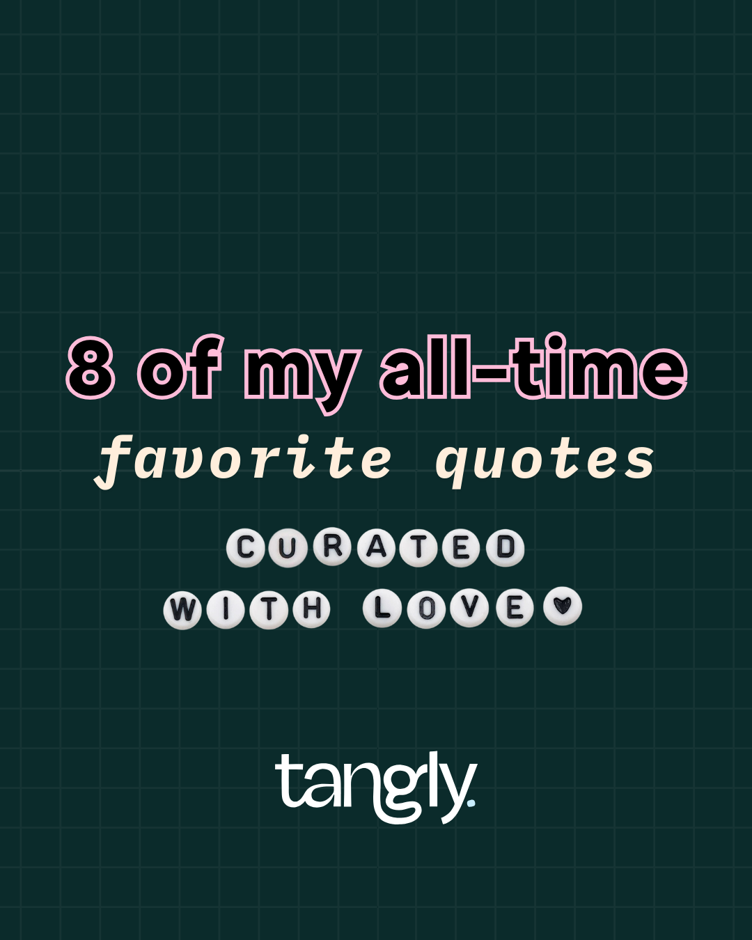
Social media is Tangly's playground for experimentation and storytelling. From bold graphics and playful animations to video content and unexpected visual compositions, at the heart of it all, a cohesive visual identity ties everything together, giving Tangly the freedom to experiment, try new things, and tell different stories while keeping everything unmistakably Tangly.
The Concept
Playfulness was at the heart of Tangly from day one. The idea was to create a visual identity that felt colorful, expressive, and full of personality, without losing its sense of cohesion. Bold enough to stand out, but considered enough to hold everything together.
We developed a flexible visual language built around vibrant colors, playful typography, and simple yet distinctive graphic elements. The result is an identity that leaves plenty of room for experimentation while maintaining a recognizable look and feel, no matter how many directions the content takes.
A little storytelling, a little creative chaos, and a whole lot of curiosity. Tangly is a personal project where ideas are free to wander, stories take unexpected turns, and there's always something new to get tangled up in.
The logo
They say there's no client more demanding than yourself, and this logo is living proof. After countless sketches, concepts, and versions (and a fair amount of second-guessing), one thing was clear: it had to be just right. The only problem? I wasn't entirely sure what just right looked like.
But after plenty of trial and error, it finally clicked. The result? A logo that feels playful, full of personality, and unmistakably Tangly. Every single time I look at it, I still absolutely love everything about it. Worth every iteration.
Brand personality
Tangly is anything but beige, and its visual identity was designed to reflect just that. Bursting with color, personality, and a healthy dose of quirkiness, every element is an invitation to get curious and have a little fun.
From paper-inspired textures and cutout-style graphics to funky animations and unexpected details, the brand embraces a playful, almost handmade aesthetic. It's a mix of digital and analog, where things don't have to be perfectly polished to feel thoughtfully designed.
The result is a visual world that's lively, expressive, and constantly evolving, while still feeling unmistakably Tangly.
Typography
For Tangly, we chose Apfel Grotesk, a contemporary sans-serif typeface with a clean, confident character. Its simple shapes and balanced proportions bring a sense of structure and clarity, helping balance out the more playful elements of the visual identity.
Versatile and easy to read, it works across everything from bold social media graphics to more informative content, keeping the brand feeling cohesive without losing its fun, approachable personality.
Social media & digital assets
Social media is Tangly's playground for experimentation and storytelling. From bold graphics and playful animations to video content and unexpected visual compositions, at the heart of it all, a cohesive visual identity ties everything together, giving Tangly the freedom to experiment, try new things, and tell different stories while keeping everything unmistakably Tangly.