The concept
Born in the aftermath of a national tragedy, Desafío Fénix needed an identity that balanced the seriousness of its mission with a forward-looking perspective.
We created a modern, clean, and understated visual identity that feels academic and professional without being overly institutional. With a light color palette, simple design elements, and clear typography, the result is an approachable and credible visual language that puts knowledge and expert voices at the forefront.
When time is critical, clarity matters. Desafío Fénix was built to turn expert knowledge into accessible information, creating a space where research, ideas, and expertise could contribute to something bigger: a safer, more resilient Venezuela.
The logo
The Desafío Fénix logo draws inspiration from the phoenix, a universal symbol of renewal and resilience. Its simple, fluid form suggests movement and transformation, reflecting the possibility of rebuilding after adversity.
Paired with clean, contemporary typography, the symbol creates a distinctive yet understated identity that feels credible, approachable, and appropriate for an academic initiative.
Color palette
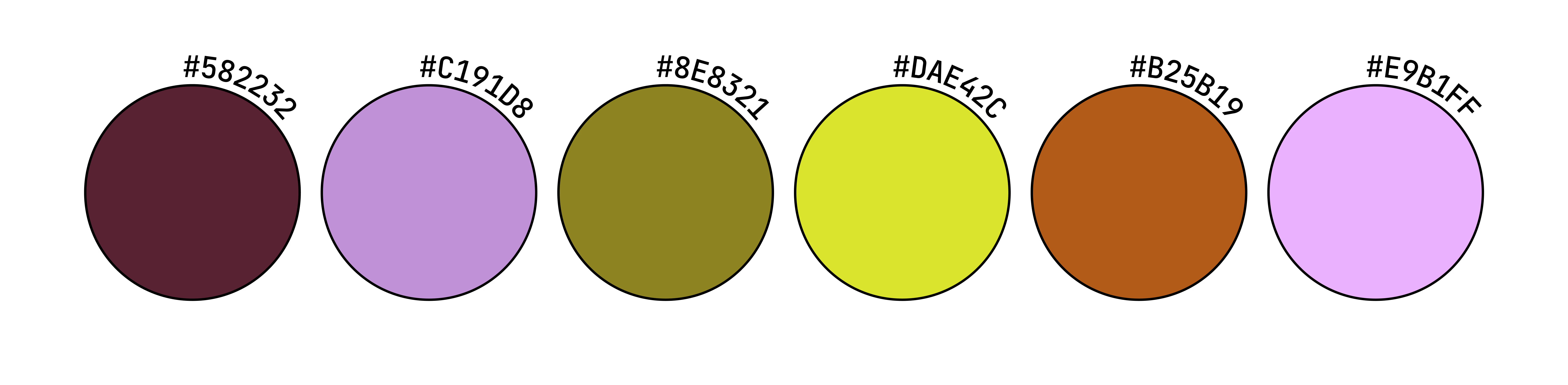
A fresh, minimal color palette brings a sense of optimism to an otherwise serious subject. Light lime green introduces energy and renewal, while cool black, soft grey, and neutral tones provide balance, clarity, and a professional foundation.
The contrast creates a visual identity that feels modern and approachable without compromising the credibility expected of an academic and technical initiative.

Typography
Designed for clarity and versatility, Inter brings a clean, modern, and professional character to Desafío Fénix's visual identity. Its balanced proportions and exceptional legibility make it ideal for presenting complex information in a clear and accessible way.
We chose this open-source typeface to reflect the project's academic and institutional nature, creating a visual language that feels credible and authoritative without being overly formal or rigid, while embracing the principles of accessibility and open knowledge.


Social media & digital assets
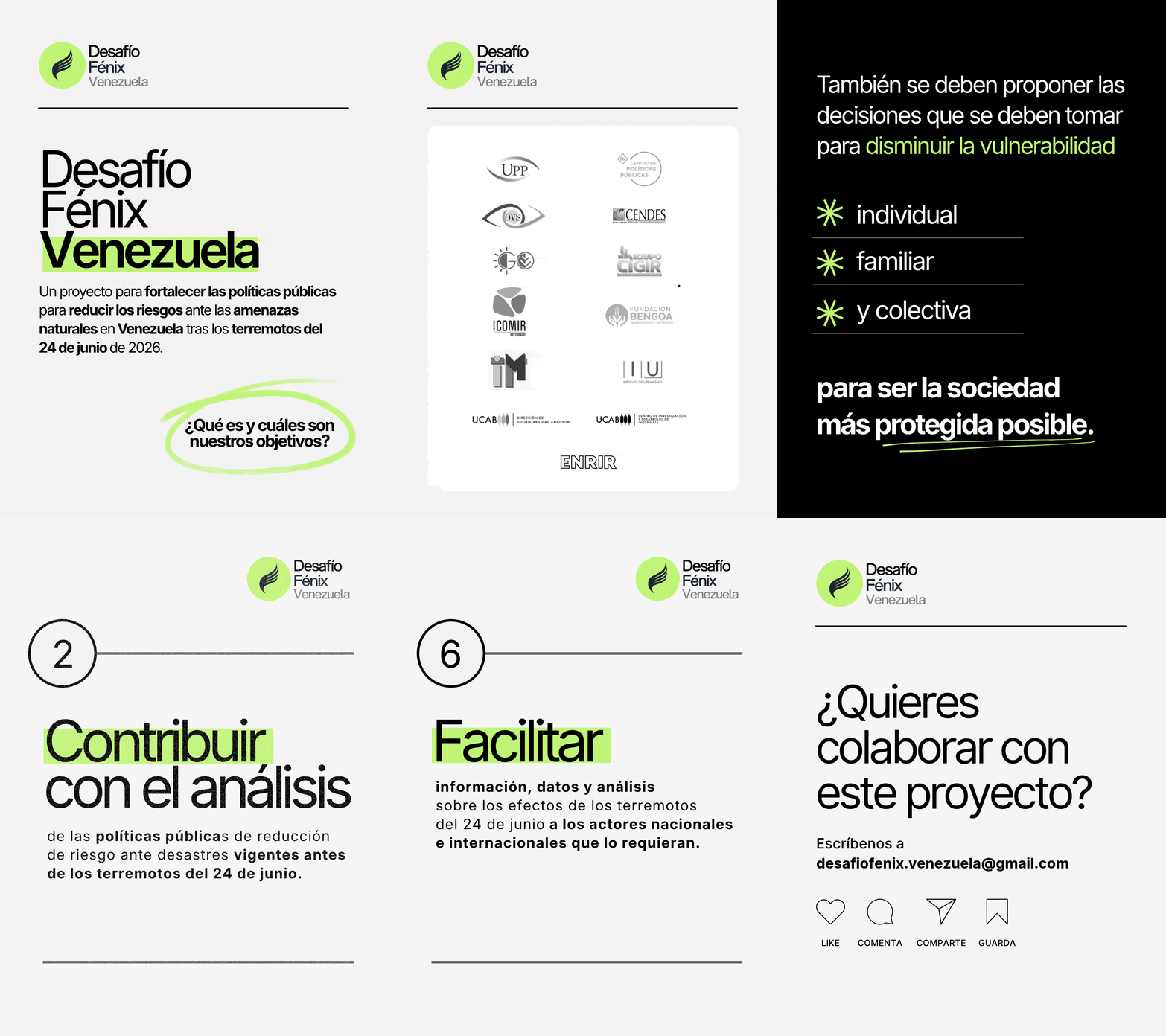
We extended Desafío Fénix's visual identity across its digital channels, creating social media templates, branded graphics, and cover images that ensured a consistent and recognizable presence. Using clean layouts, bold typography, and strategic pops of lime green, we developed a flexible visual system designed to communicate complex information clearly, highlight key messages, and make expert knowledge more accessible.
The website: a digital hub for knowledge & research
We designed and developed an informative website that brings together data, research, and insights from over 11 research institutions and dozens of subject-matter experts. With more than 35 articles and publications, the platform serves as a central hub for knowledge sharing.
The Concept
Born in the aftermath of a national tragedy, Desafío Fénix needed an identity that balanced the seriousness of its mission with a forward-looking perspective.
We created a modern, clean, and understated visual identity that feels academic and professional without being overly institutional. With a light color palette, simple design elements, and clear typography, the result is an approachable and credible visual language that puts knowledge and expert voices at the forefront.
When time is critical, clarity matters. Desafío Fénix was built to turn expert knowledge into accessible information, creating a space where research, ideas, and expertise could contribute to something bigger: a safer, more resilient Venezuela.
The logo
The Desafío Fénix logo draws inspiration from the phoenix, a universal symbol of renewal and resilience. Its simple, fluid form suggests movement and transformation, reflecting the possibility of rebuilding after adversity.
Paired with clean, contemporary typography, the symbol creates a distinctive yet understated identity that feels credible, approachable, and appropriate for an academic initiative.
Color palette
A fresh, minimal color palette brings a sense of optimism to an otherwise serious subject. Light lime green introduces energy and renewal, while cool black, soft grey, and neutral tones provide balance, clarity, and a professional foundation.
The contrast creates a visual identity that feels modern and approachable without compromising the credibility expected of an academic and technical initiative.
Typography
Designed for clarity and versatility, Inter brings a clean, modern, and professional character to Desafío Fénix's visual identity. Its balanced proportions and exceptional legibility make it ideal for presenting complex information in a clear and accessible way.
We chose this open-source typeface to reflect the project's academic and institutional nature, creating a visual language that feels credible and authoritative without being overly formal or rigid, while embracing the principles of accessibility and open knowledge.
Social media & digital assets
We extended Desafío Fénix's visual identity across its digital channels, creating social media templates, branded graphics, and cover images that ensured a consistent and recognizable presence. Using clean layouts, bold typography, and strategic pops of lime green, we developed a flexible visual system designed to communicate complex information clearly, highlight key messages, and make expert knowledge more accessible.
The website: a digital hub for knowledge & research
We designed and developed an informative website that brings together data, research, and insights from over 11 research institutions and dozens of subject-matter experts. With more than 35 articles and publications, the platform serves as a central hub for knowledge sharing.