The Concept
Two brothers, a family recipe, and a love for good food. De Aquí brings them together in a range of handmade hot sauces that don't take themselves too seriously.
Inspired by family traditions, local ingredients, and a healthy dose of humour, we set out to create an identity that feels as bold, vibrant, and full of character as the sauces themselves.
Three sauces, three personalities, one big family.
A playful visual identity where bold colors, expressive typography, and hand-drawn details bring every flavor to life.
The logo
The De Aquí logo sets the tone for the entire identity: bold, expressive, and playful. With a nod to vintage aesthetics and a modern twist, we wanted to create something distinctive without stealing the spotlight from the rest of the visual identity. A simple yet lighthearted logo with just enough personality to stand on its own, while letting the colours, illustrations, and packaging do the talking.
Color palette
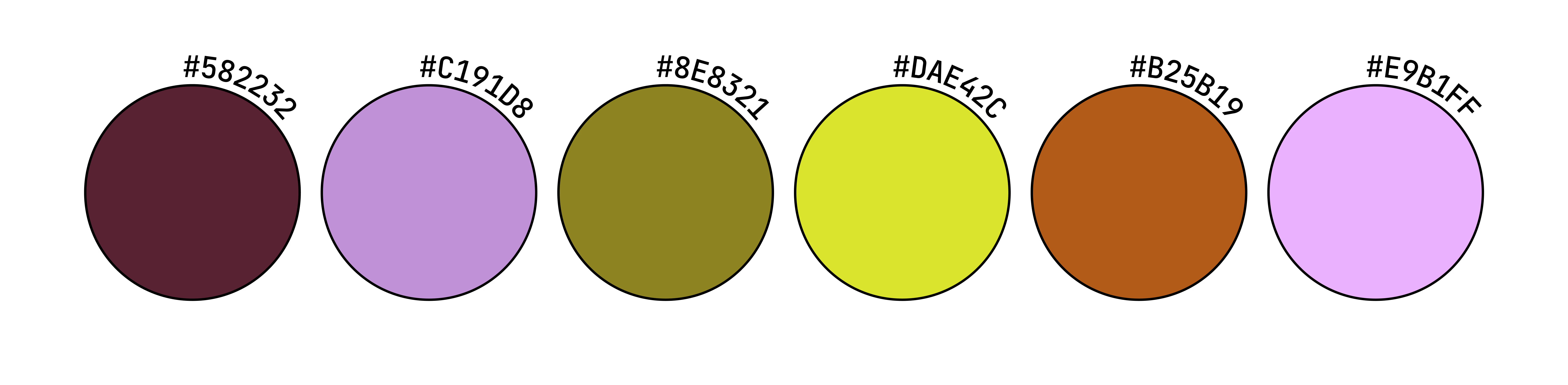
De Aquí's color palette is bold, vibrant, and full of personality.
A playful mix of earthy, warm tones and unexpected pops of bright color reflects the brand's connection to natural ingredients while bringing a fresh, contemporary energy to its identity. The contrasting shades give each sauce its own character while keeping the collection cohesive and instantly recognisable.

Typography
Originally designed for developers, JetBrains Mono brings a functional, slightly retro character to De Aquí's visual identity.
Its monospaced structure and clean, geometric letterforms create an interesting contrast with the brand's playful illustrations and logo. We chose it for its distinctive personality and legibility, adding a touch of nostalgia while keeping the overall identity simple and contemporary.

Three Flavors, Three Personalities
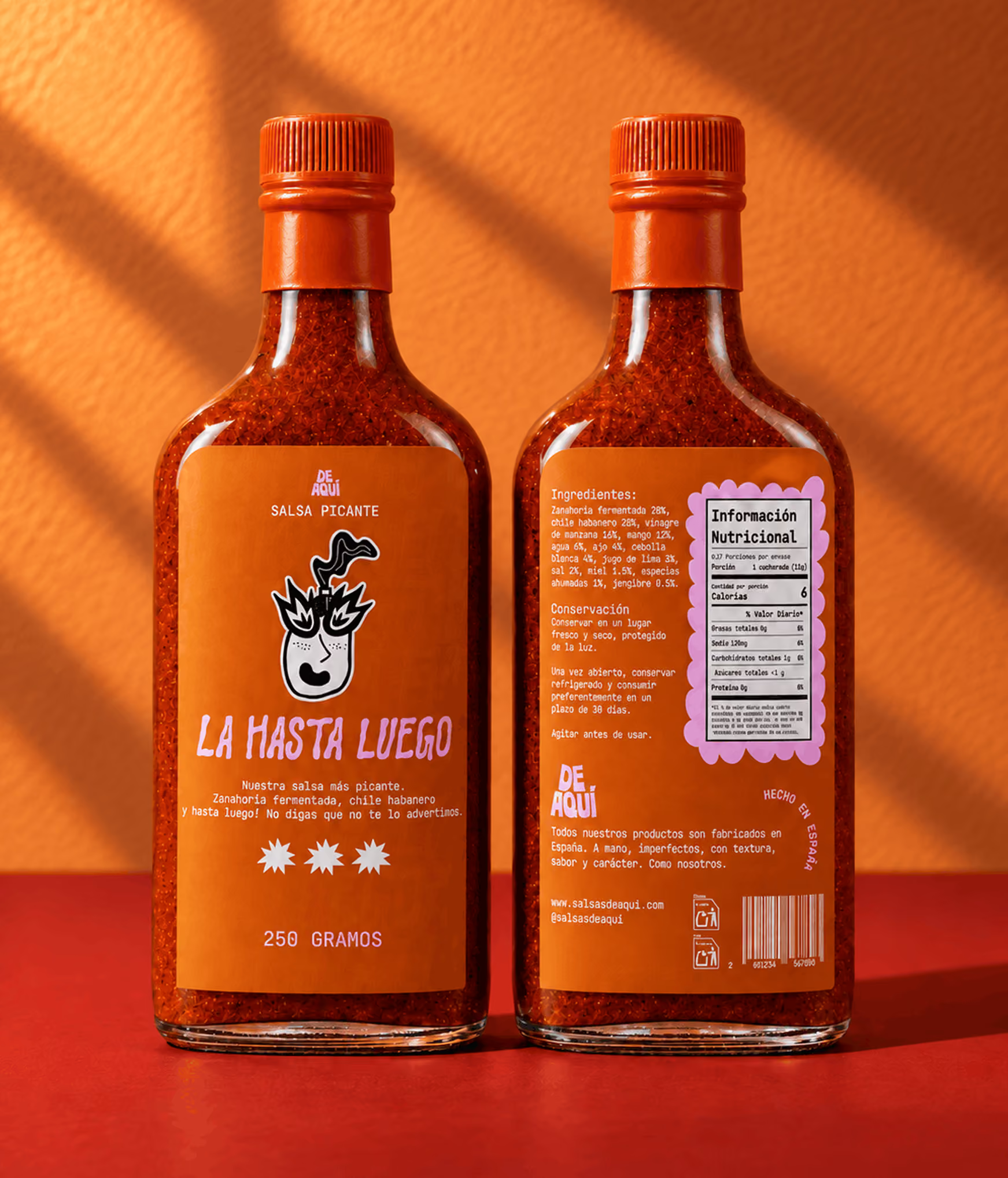
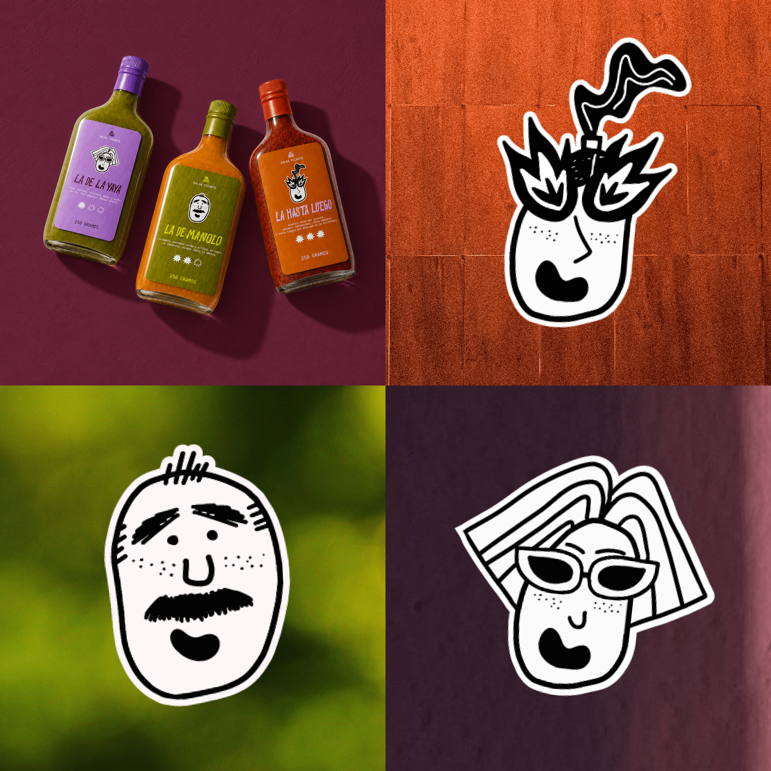
Each sauce has its own name, personality, and story to tell. We developed a flexible label system that gives every flavor room to shine, while keeping the three unmistakably part of the same family. From the comforting La de la Yaya to the bold La de Manolo and the fiery Hasta Luego, every detail reflects the character of what's inside the bottle.
Custom Illustrations
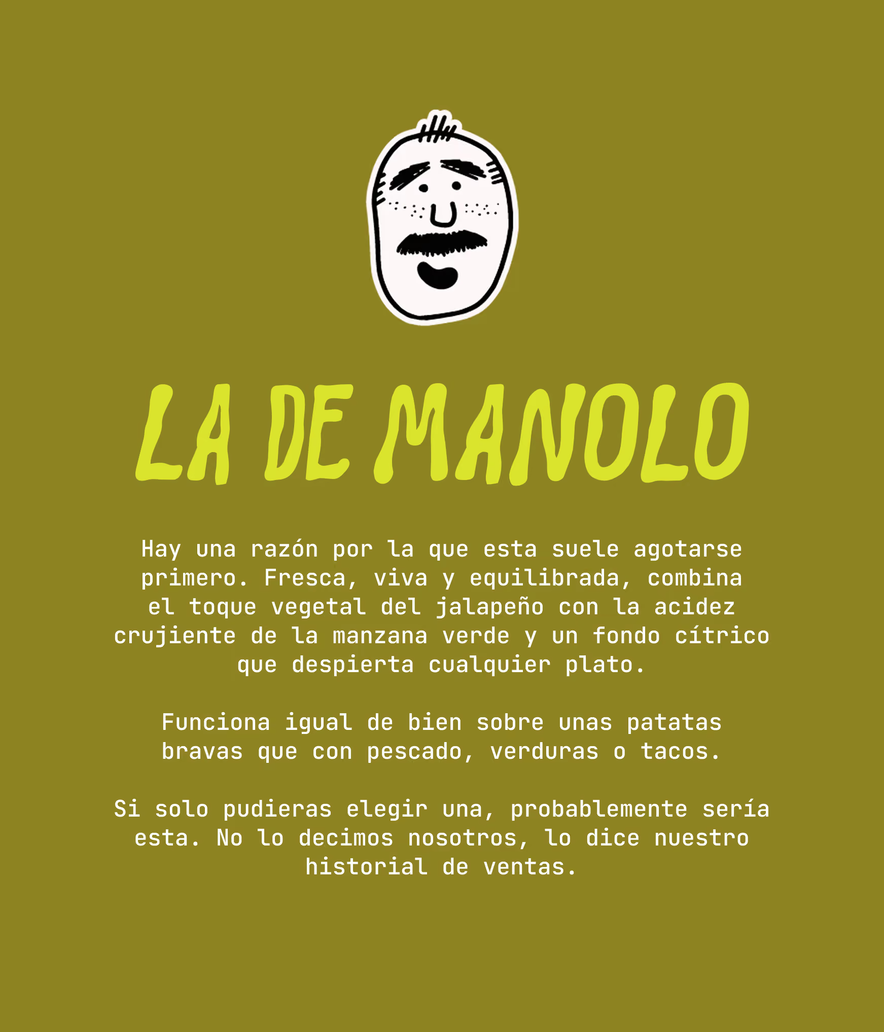
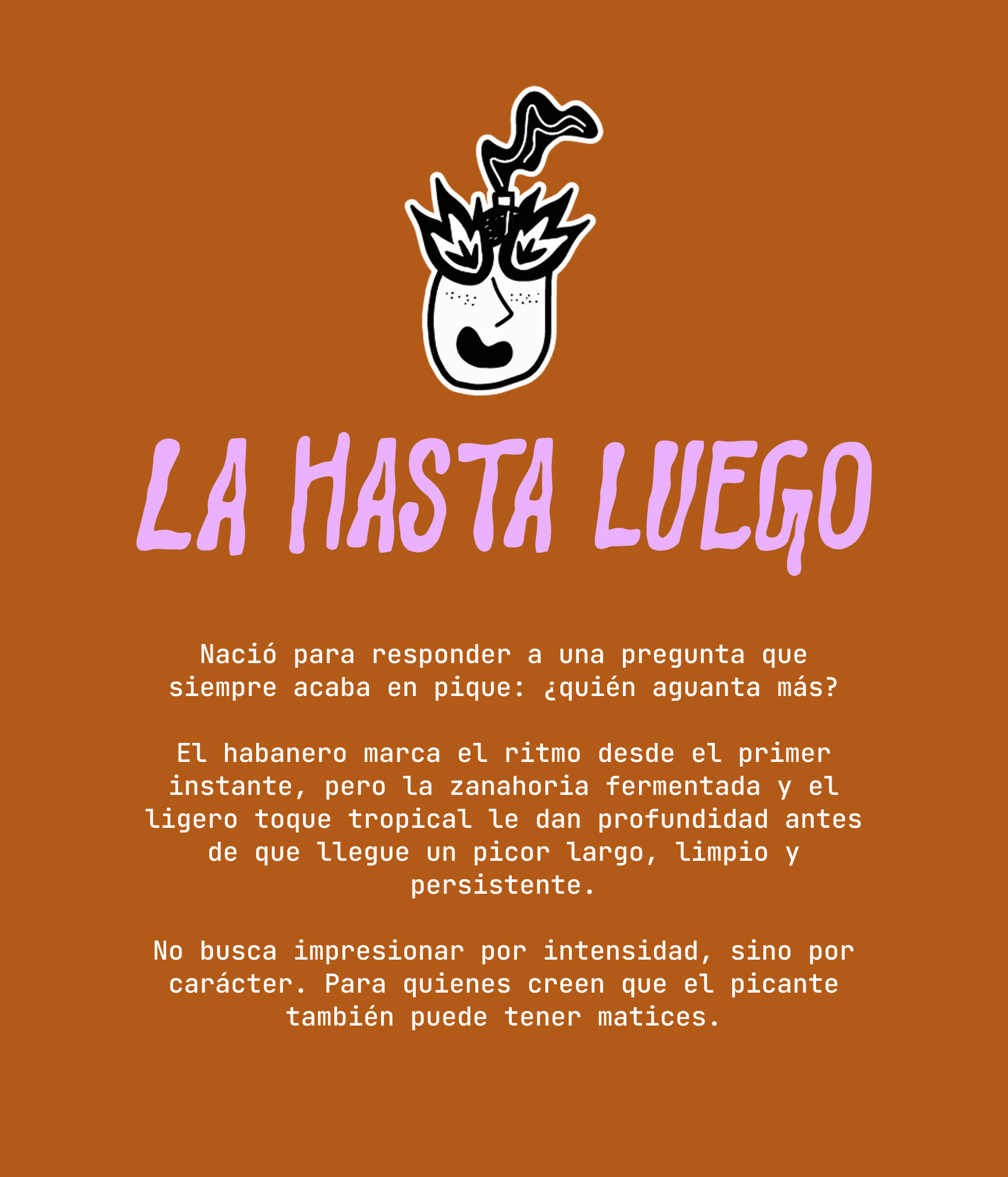
Our custom illustrations bring De Aquí's characters to life. La Yaya and Manolo step out of their labels with personalities of their own, while a fearless girl with flame-shaped eyes takes on the ultimate challenge: a taste of La Hasta Luego. Hand-drawn, expressive, and full of humour, these illustrations add another layer of storytelling to the brand's visual universe.
Loyalty Card
A little reward for the hot sauce lovers. We designed a playful loyalty card that brings De Aquí’s personality into every purchase, turning nine stamps into a free bottle of their favourite sauce.
The Concept
Two brothers, a family recipe, and a love for good food. De Aquí brings them together in a range of handmade hot sauces that don't take themselves too seriously.
Inspired by family traditions, local ingredients, and a healthy dose of humour, we set out to create an identity that feels as bold, vibrant,
and full of character as the sauces themselves.
Three sauces, three personalities, one big family.
A playful visual identity where bold colours, expressive typography, and hand-drawn details bring every flavour to life.
The logo
The De Aquí logo sets the tone for the entire identity: bold, expressive, and playful. With a nod to vintage aesthetics and a modern twist, we wanted to create something distinctive without stealing the spotlight from the rest of the visual identity. A simple yet lighthearted logo with just enough personality to stand on its own, while letting the colours, illustrations, and packaging do the talking.
Color palette
De Aquí's colour palette is bold, vibrant, and full of personality.
A playful mix of earthy, warm tones and unexpected pops of bright colour reflects the brand's connection to natural ingredients while bringing a fresh, contemporary energy to its identity. The contrasting shades give each sauce its own character while keeping the collection cohesive and instantly recognisable.
Typography
Originally designed for developers, JetBrains Mono brings a functional, slightly retro character to De Aquí's visual identity.
Its monospaced structure and clean, geometric letterforms create an interesting contrast with the brand's playful illustrations and logo. We chose it for its distinctive personality and legibility, adding a touch of nostalgia while keeping the overall identity simple and contemporary.
Three Flavors, Three Personalities
Each sauce has its own name, personality, and story to tell.
We developed a flexible label system that gives every flavour room to shine, while keeping the three unmistakably part of the same family. From the comforting La de la Yaya to the bold La de Manolo and the fiery Hasta Luego, every detail reflects the character of what's inside the bottle.
Custom Illustrations
Our custom illustrations bring De Aquí's characters to life. La Yaya and Manolo step out of their labels with personalities of their own, while a fearless girl with flame-shaped eyes takes on the ultimate challenge: a taste of La Hasta Luego. Hand-drawn, expressive, and full of humour, these illustrations add another layer of storytelling to the brand's visual universe.
Loyalty Card
A little reward for the hot sauce lovers. We designed a playful loyalty card that brings De Aquí’s personality into every purchase, turning nine stamps into a free bottle of their favourite sauce.