The Concept
Ánima was born from the idea that scent has the power to bring us back to a place, a moment, or a feeling.
Inspired by its founder's travels, each candle captures the essence of a different city, turning memories and atmospheres into fragrances for the home. We translated this idea into a warm, playful visual identity that celebrates curiosity, discovery, and the little details that make every place unforgettable.
More than just candles, Ánima is an invitation to travel through scent. A collection of places, memories, and little moments brought to life through fragrances, colours, and hand-drawn illustrations.
Each one tells a different story, but all share the same spirit of curiosity, warmth, and discovery.
A Logo with a Human Touch
Ánima's logo was drawn by hand to reflect the warmth and personality behind the brand. Its organic, imperfect lines give it a playful, approachable character, setting the tone for an identity that feels personal, expressive, and anything but ordinary.
Color palette
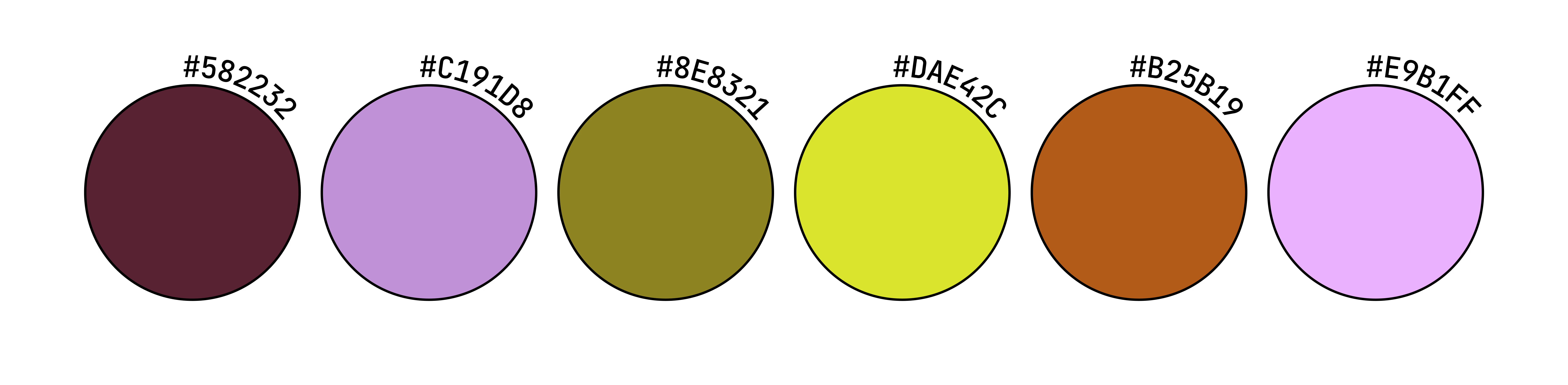
De Aquí's colour palette is bold, vibrant, and full of personality.
A playful mix of earthy, warm tones and unexpected pops of bright colour reflects the brand's connection to natural ingredients while bringing a fresh, contemporary energy to its identity. The contrasting shades give each sauce its own character while keeping the collection cohesive and instantly recognisable.

Typography
Ánima's visual identity combines two serif typefaces: Libre Baskerville Italic and Old Style 1.
Libre Baskerville is an open-source typeface based on the classic Baskerville design, with elegant proportions and a strong editorial character. Its italic style adds a softer, more romantic touch.
Old Style 1 brings a traditional, vintage-inspired feel through its distinctive letterforms. Together, the two typefaces create a typographic system that feels timeless, romantic, and full of character, while maintaining readability and consistency across the brand.
The Fragrances:
Different Cities, Different Stories.
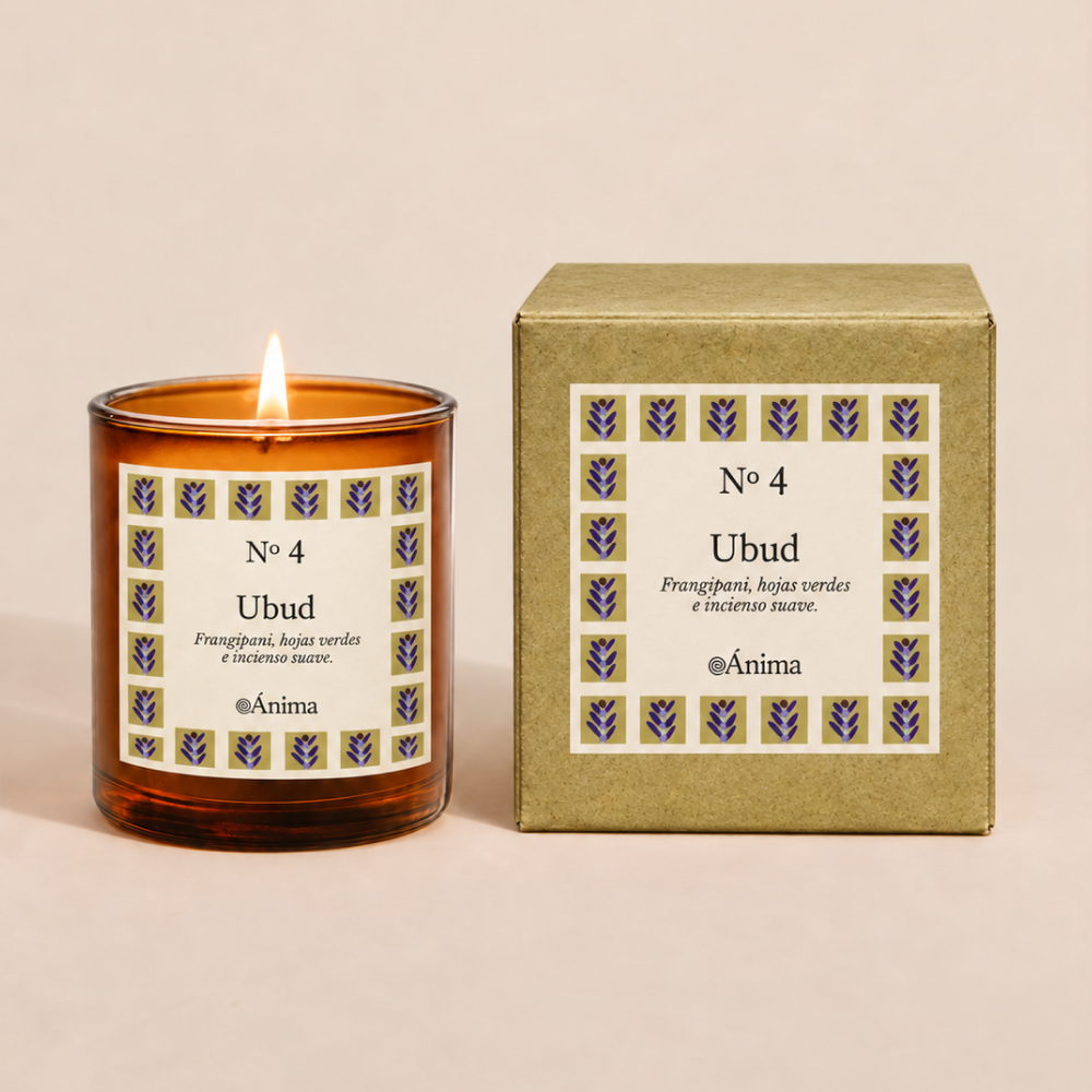
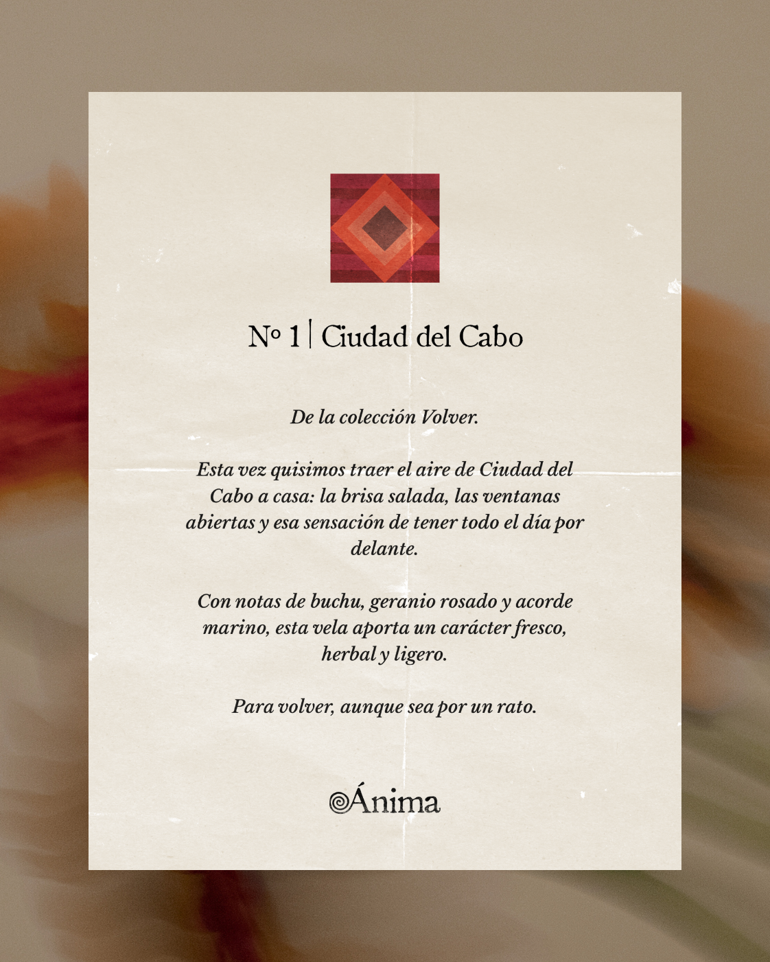
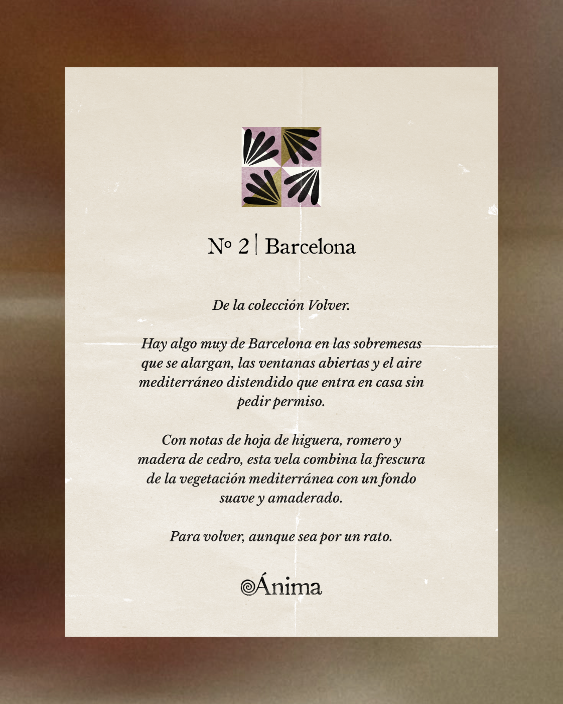
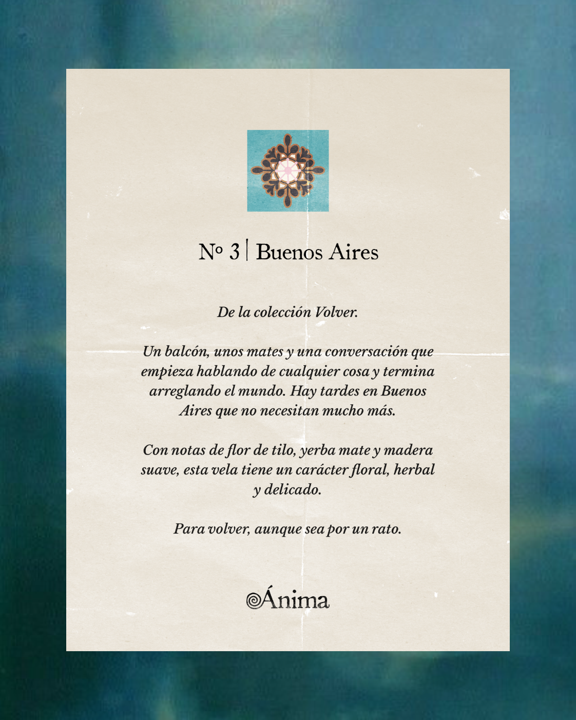
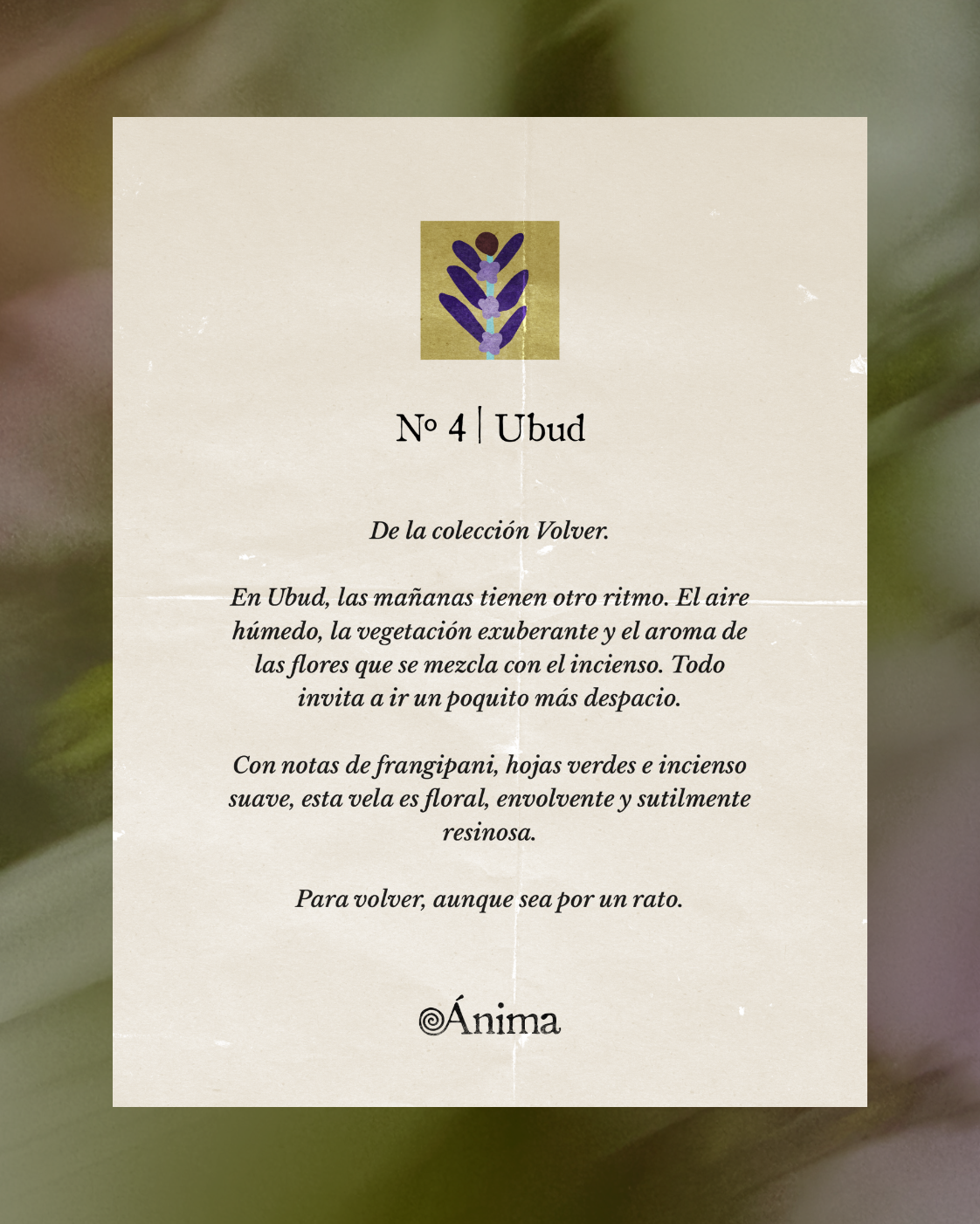
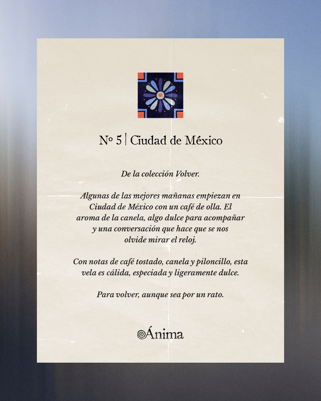
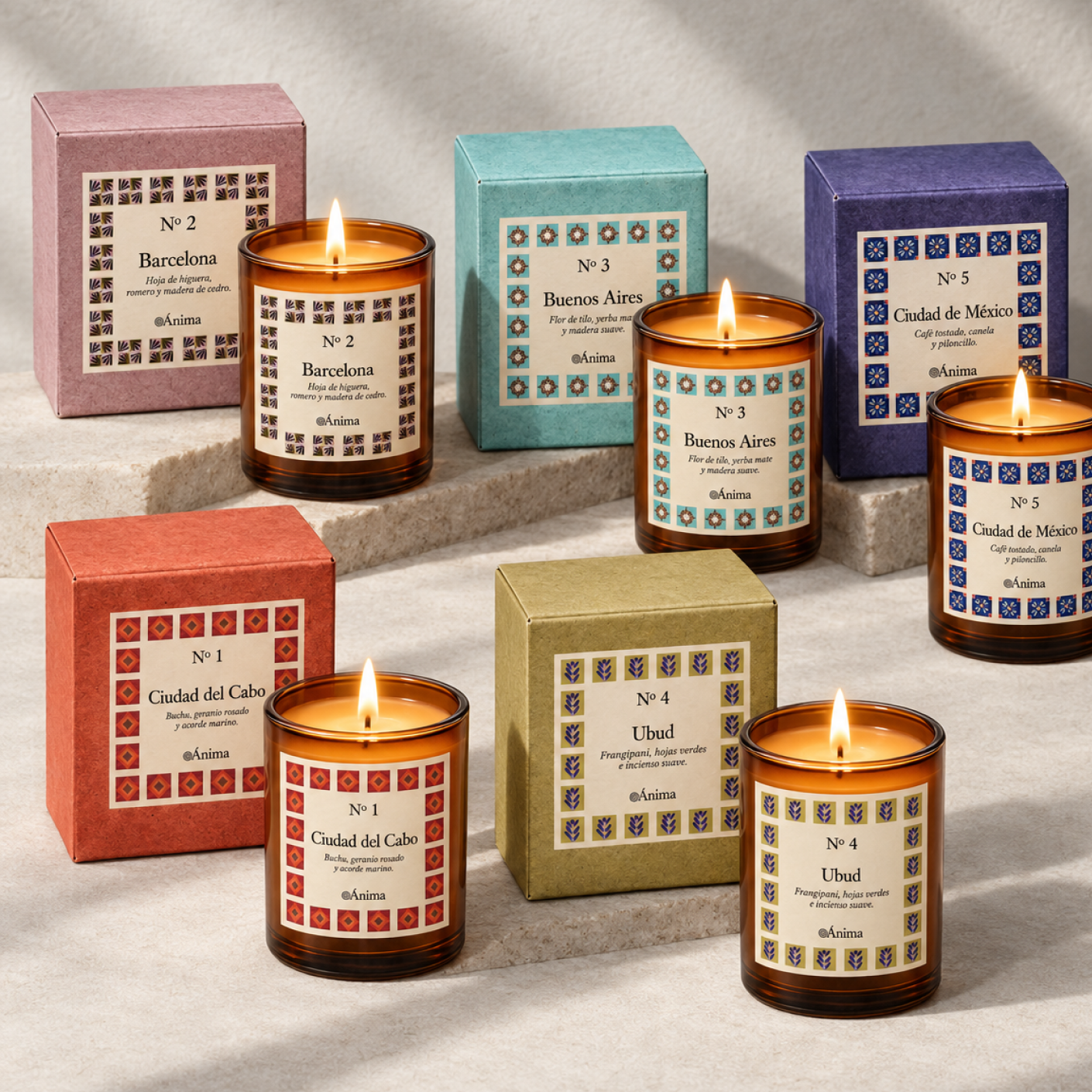
Every fragrance has its own destination, personality, and story to tell. We created a flexible packaging system that gives each city room to shine, combining custom illustrations, colour, and thoughtful details into a collection that feels connected without losing what makes each candle unique.
The Concept
Ánima was born from the idea that scent has the power to bring us back to a place, a moment, or a feeling.Inspired by its founder's travels, each candle captures the essence of a different city, turning memories and atmospheres into fragrances for the home.
We translated this idea into a warm, playful visual identity that celebrates curiosity, discovery, and the little details that make every place unforgettable.
More than just candles, Ánima is an invitation to travel through scent. A collection of places, memories, and little moments brought to life through fragrances, colours, and hand-drawn illustrations. Each one tells a different story, but all share the same spirit of curiosity, warmth, and discovery.
A Logo with a Human Touch
Ánima's logo was drawn by hand to reflect the warmth and personality behind the brand. Its organic, imperfect lines give it a playful, approachable character, setting the tone for an identity that feels personal, expressive, and anything but ordinary.
Color palette
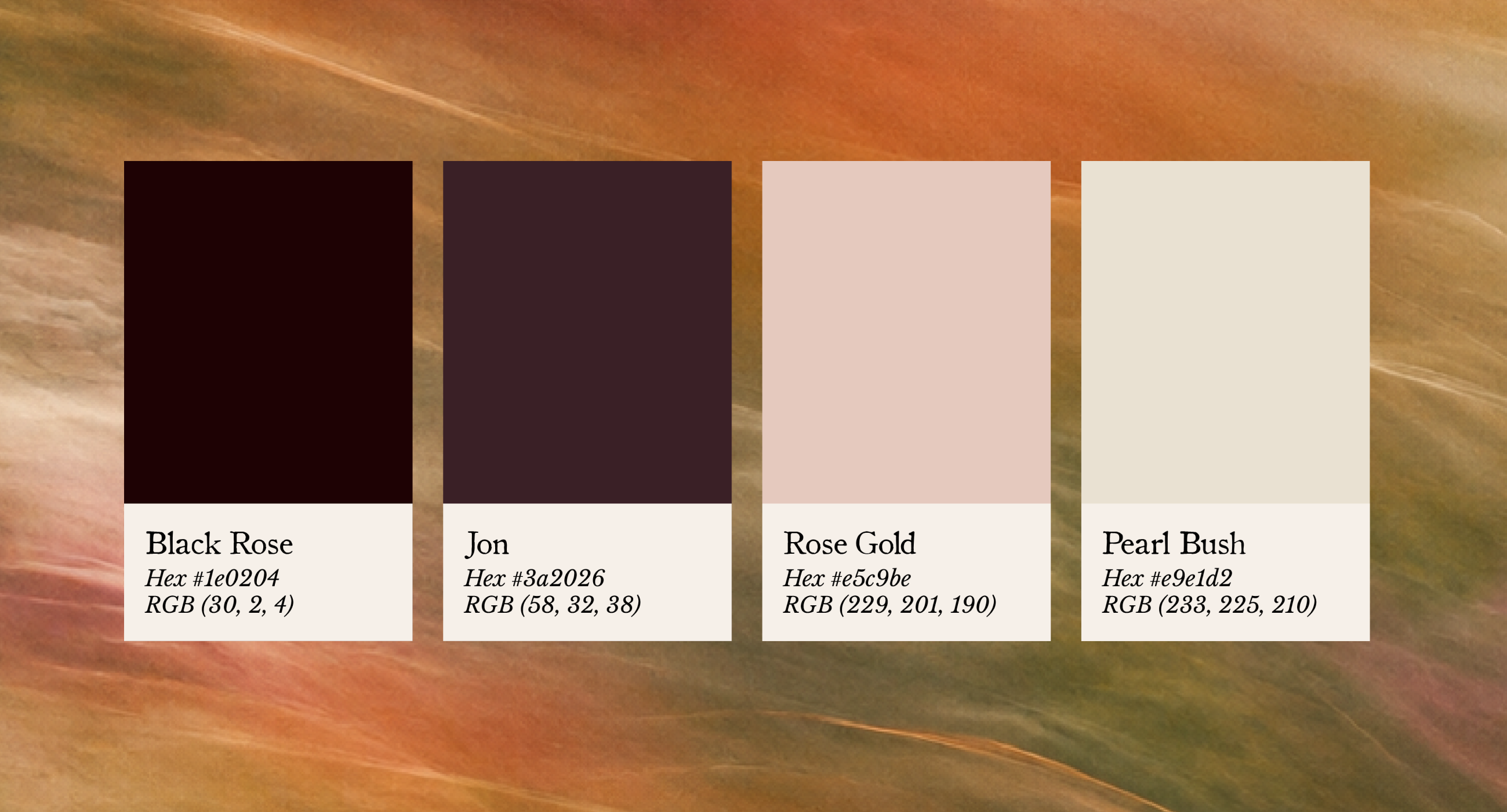
Ánima’s colour palette was designed to be simple, warm, and understated, allowing each fragrance to have its own distinct colours and visual identity.Inspired by nature, the palette brings together soft, earthy tones with a subtle romantic feel. These colours create a timeless foundation for the brand, bringing consistency to the collection while giving each fragrance the freedom to tell its own story.
Typography
Ánima's visual identity combines two serif typefaces: Libre Baskerville Italic and Old Style 1.Libre Baskerville is an open-source typeface based on the classic Baskerville design, with elegant proportions and a strong editorial character. Its italic style adds a softer, more romantic touch.
Old Style 1 brings a traditional, vintage-inspired feel through its distinctive letterforms.
Together, the two typefaces create a typographic system that feels timeless, romantic, and full of character, while maintaining readability and consistency across the brand.


The Fragrances:
Different Cities, Different Stories.
Every fragrance has its own destination, personality, and story to tell. We created a flexible packaging system that gives each city room to shine, combining custom illustrations, colour, and thoughtful details into a collection that feels connected without losing what makes each candle unique.